

Responsive Website for Claws & Paws - A Case Study
The problem - The adoption process for pets often begins online and families need reliable resources for understanding what potential pets are available and resources to help with successful adoption.
The goal - Provide a reliable resource and accurate and timely information about pet adoption, availability, and integration into the family.
Tools - Adobe Creative Suite (XD, Indesign and Photoshop) pen & paper

User research - Persona: Michael
My research consisted of competitor research, user interviews, and usability studies both in-person and virtual. To begin the process I reflected on my experience as a pet owner and the exposure to the adoption process I experienced with my own search. I assumed I had similar experiences as others when finding a pet for my family.
While conducting research, I discovered that some users who did not grow up with pets needed additional resources and information that I did not. The process could feel overwhelming to these users. I also learned that reliable and current information on adoption websites were lacking.
User research: pain points
Lack of timely information and regularly updated websites prevents users from knowing which cats and dogs are available.
Users want to select pets from pictures and this helps them connect with the companion dog or cat. Providing pictures is important.
Resources and information about choosing the right pet is important to users - especially new pet owners.
Users select pets from images and specific information provided on individual animals most often. Detailed specific information is needed.

User journey map
My goal would be to provide our users with updated information regularly as well as specific information about each potential pet. The website would also feature resources and assistance in the adoption process to provide the best matching possible for pet and pet parents.

Sitemap - Accurate daily updating of the website, strong intake process for pets, and providing a vet evaluation for each animal is a goal

Home page paper wireframes - I wanted to provide as many opportunities for images of animals as possible so that users are hooked emotionally by the dogs and cats and also feature certain potential pets who have been in our care the longest.

Paper wireframe screen size variations - When designing for additional screen sizes I wanted to keep the images as large as possible without cluttering the home page. I also wanted to provide clear navigation to information. These two things were my primary goal. My solution was to provide a carousel of potential cats and dogs and above that a hero image and links to resources.
Digital wireframes - Feedback from peers suggested that, like users, they want large engaging images when selecting pets.

A carousel of dogs & cats provides users with images of available pets. Featured images can become larger with a nested carousel.

When designing for a smaller screen it was important for users to have large images to connect emotionally to the potential pet while still providing a clear navigation to important information. I chose a hamburger menu for an efficient option.
Low-fidelity prototype
My prototype was somewhat confusing for some peer navigation as I needed clearer direction from the Home page. I implemented a new button design and clearer text in my call to action locations.

Usability study
Unmoderated 20 minute remote study of five participants
Finding 1: Some users had difficulty navigating from the Home page so clearer navigation prompts and language is needed.
Finding 2: Users did not find the filters on the Adopt page helpful and some thought they had already selected their pet before navigating to the Adopt page.
Finding 3: Large images of cats and dogs were important to users and they want the ability to “Like” a pet and get more information.

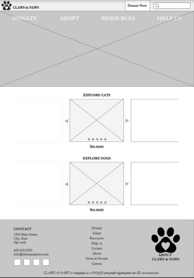
Home page - includes a carousel but directional arrows cover images and "See more cats" or "See more dogs" links were not clear for users.

Available cats page - Users want to be able to "like" potential pets.

Pet detail page - Users had difficulty with the "I like this one!" button as it clear navigation to adoption.

Adopt page with the five part filter was confusing for users as some had already decided on adopting a specific pet.

Responsive home page mockup with improved "See more cats" and "See more dogs" buttons and carousel arrows moved outside images

"See more dogs" and "See more cats" pages include the ability to "like" animals with a heart icon to the lower left of each potential pet image

Animal detail page with new labeling for the button "I'd like to adopt this one" and back button

Adopt page with four step adoption information at top and back button at bottom and five part filter removed
Mockups:
Original website screen size and mobile screen variation

High-fidelity prototype
The user flow begins at the Home page where several featured pets are available in a carousel and a button can take them to “See all dogs” or “See all cats”. Selecting a dog or cat brings the user to a pet detail page to get more information and if selected back button or forward to the adoption page by pressing the “I’d like to adopt this one!” button. Additional options and pages were detailed as well.
Accessibility Considerations
Following the Web Content Accessibility Guidelines (WCAG) for luminosity contrast. This will assist all users whether they have permanent, temporary or situational sight disabilities or none at all.
Using hierarchical headings to make the website more accessible and easier for all users.
Utilizing icons and images in addition to text for additional accessibility.


Takeaways
“I love it - I would totally use this site to adopt my next pet!” - Cara
I learned it is incredibly helpful to get diverse perspectives when considering needs of users. User exposure to ideas and concepts vary greatly, and designing with this diversity of knowledge allows designs to be relevant to more users.
“So helpful to know the Claws & Paws site is updated regularly and has accurate information.” - Eric